Boston Sprocket

Our Design Philosophy
How does design tie into the professionalism of Ultimate? To grow the sport, we believe that uniforms should be showcased in the most professional look and feel possible while keeping the spirit of each team's identity alive. As media coverage of Ultimate expands to the broader world, we want any club or school to feel proud to wear their uniforms.
BOSTON SPROCKET
During 2020 and early 2021, rumors abounded of a new mixed team on the scene in Boston. Sprocket was always going to have their work cut out for them in possibly the most competitive region in the country, and we were really excited at the prospect of working from the ground up to help design their uniforms for their inaugural season.
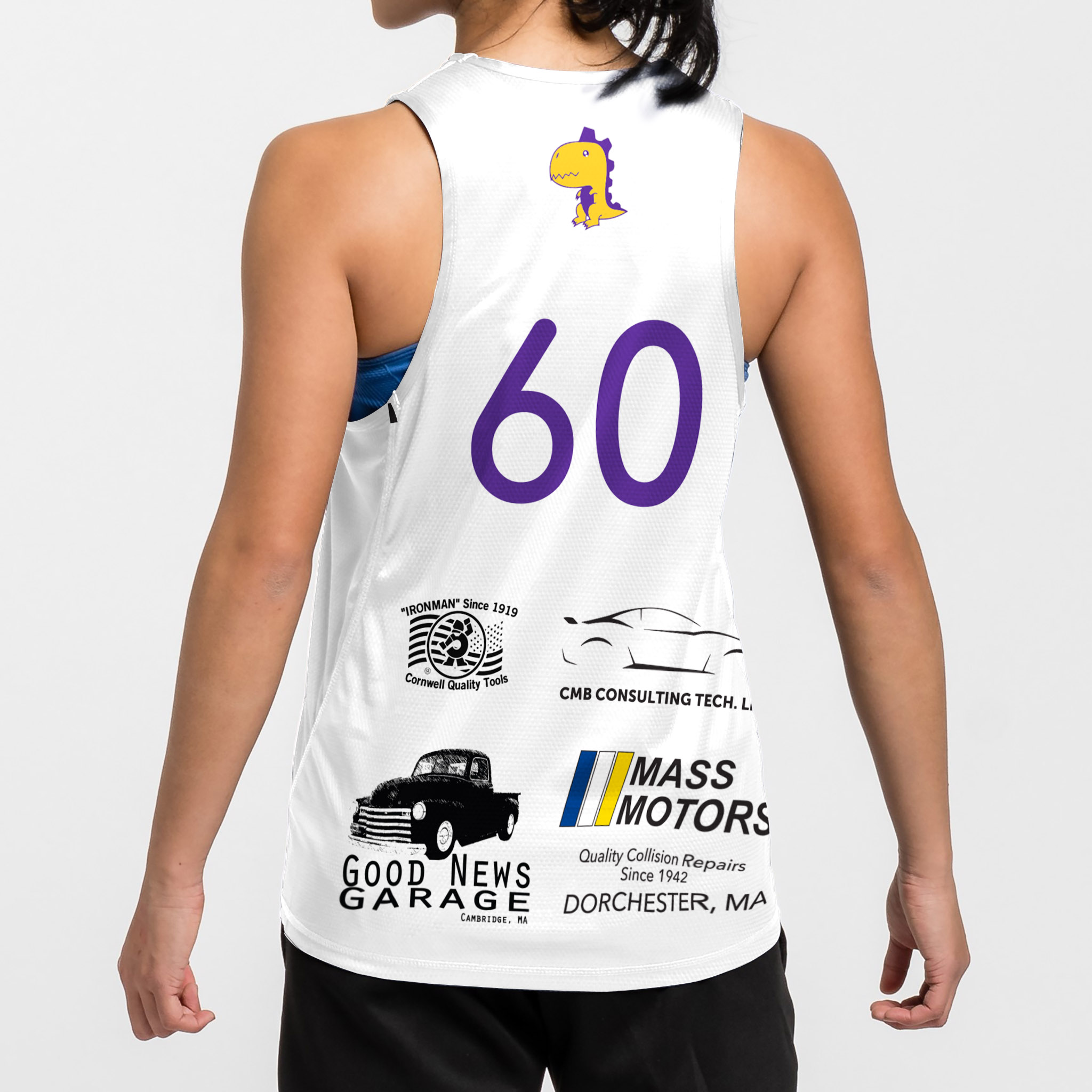
One of the goals of the team was to make the season as accessible as possible which resulted in them securing four local sponsors whose logos needed to be displayed on their playing kit.
Alongside those, the key pieces we had to work with were:
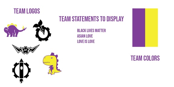
- Team logos:
- Cartoon-style cog with lightning bolt wings
- Dinosaur
- Plant sprouting out of a cog
- Team colors:
- Purple
- Yellow
- Team themes:
- Cogs + Machinery
- Team elements:
- 3 sponsorships to be displayed on the back
- Team statements to display:
- Black Lives Matter
- Asian Love
- Love is Love
-1.jpg?width=1066&height=1600&name=Club%20Champs%2020211021091744GFP-(ZF-0229-18418-1-002)-1.jpg)
DESIGNED WITH SPONSORED IN MIND
Sprocket completed our Free Jersey offer, where we design, create, and send a jersey in the team’s style to the captain for only the price of shipping.
The leadership worked with our customer success team to refine and create the design. The team presented their ideas in a drawing - and the design evolved subtly to be what it is today. With the goal of creating a professional jersey, and with a number of elements to fit in, it was important to keep any additions to the jersey fairly minimalist and subtle. We wanted the focus to be on the unique color contrast and eye-catching Sprocket assets.
Completing the Free Jersey Offer so early in the year allowed the captains to have a physical jersey in time for their first practices as a team, to not only try out sizing but also get the team excited to rep the designs.
The dark and light are detailed below:
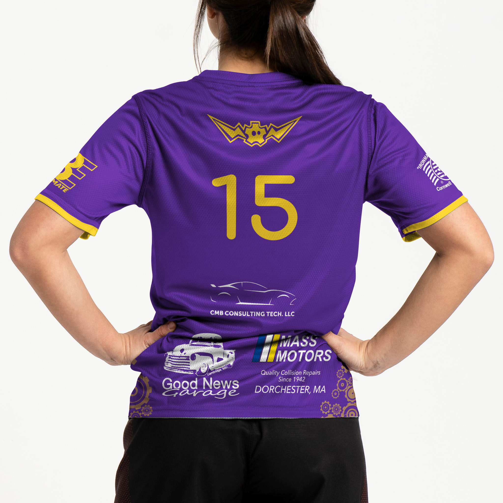
DARK:
- Purple with yellow icons, sleeve trim and details
- Front
- Bold and simple cog icon for number
- Faded cog design on bottom as a recall to theme
- Back
- Primary team logo of cog with lightning bolt wings
- Plenty of room for multiple sponsorship logos



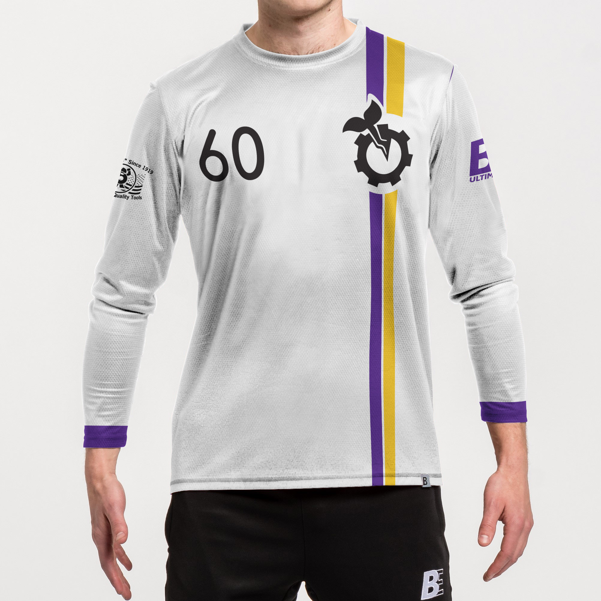


WHITE:
- Purple trim for sleeves
- Front
- Soccer-style professional feel with asymmetrical stripes
- Secondary team logo (sprout in cog) with number mirrored
- Back:
- Tertiary team logo (dinosaur) above number
- Simple design allows sponsorship logos to take full stage
GOING BEYOND THE BASICS
As an exciting new mixed team, Sprocket wanted to design multiple pieces to be able to feature their multiple team elements, as well as provide variety in their team gear.
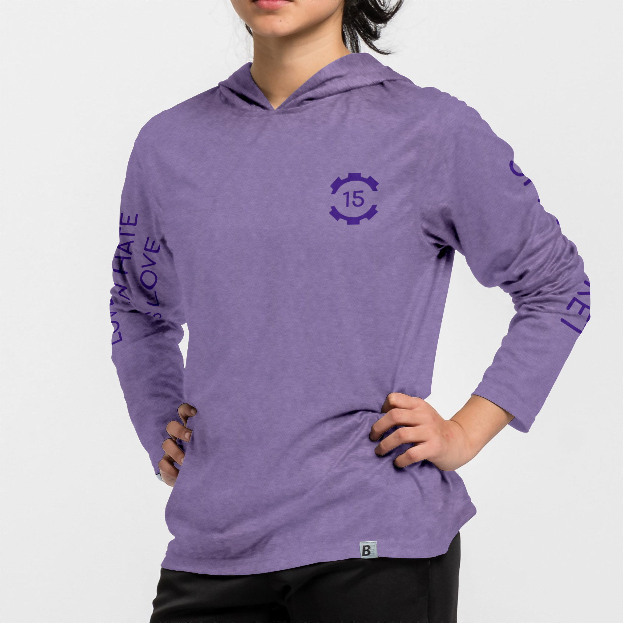
Our Customer Success team helped them design a long sleeve, singlet, sun hoodie and crewneck, for performance in all conditions.
The Sun Hoodie was especially exciting for the team, since it allowed them a place to express their team values of equality and justice and a simple heather color with social justice mottos on the sleeve. Almost every single player purchased one.
Sprocket took advantage of our Team Store function to allow the team to browse a wide array of products, few of which had any minimums to worry about while ordering



.jpg)


